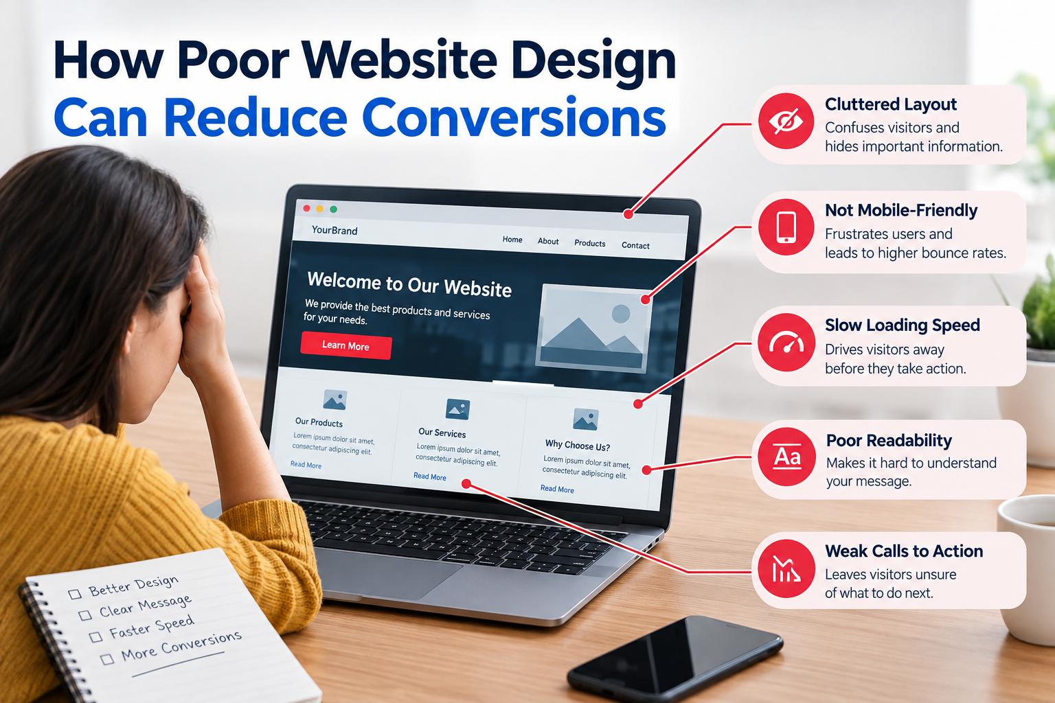
If visitors cannot quickly see what you offer find what they need or feel sure about taking the step they may leave without calling you or buying something.
That is why website design is more than colors, pictures and style. Good design should help visitors move through your website easily and do actions that matter.
A bad website design can create friction at every part of the visitor’s journey.
From confusing navigation to slow pages and weak calls to action small design problems can hurt engagement and conversions.
What Is a Website Conversion?
A conversion happens when a visitor does something that matters to your business.
On websites it might mean:
- Making a purchase
- Filling out a contact form
- Requesting a quote
- Booking an appointment
- Calling your business
- Signing up for a newsletter
- Downloading a resource
- Creating an account
Your conversion does not always have to be a sale. The key point is that the visitor completes a business action you planned.
1. Confusing Navigation Makes Visitors Work Too Hard
Visitors should not have to figure out how your website works.
If important pages hide inside menus users may get frustrated and leave.
For example a service business might have pages for SEO, web design, PPC and content marketing. If these services are buried under menu levels potential customers may not find the information they need.
How to Improve Navigation
Keep your navigation simple.
Use labels such as:
- Services
- About
- Pricing
- Case Studies
- Blog
- Contact
Make important pages reachable within a few clicks.
A website audit can also spot navigation paths missing links and pages that get little internal traffic.
2. Weak Calls to Action Can Reduce Conversions
A visitor may be interested in your service but still not know what to do
A vague button such as “Learn More” does not always show the step clearly.
Specific calls to action give better direction such as:
- Request a Free Consultation
- Get a Website Audit
- Book a Call
- Request a Quote
- View Our Services
Make calls to action easy to find.
Important calls to action should show up without users searching for them.
Place relevant calls to action in:
- The homepage hero section
- Service pages
- Product pages
- Blog content
- Pricing sections
- Contact sections
Avoid filling every section with buttons. Many competing calls to action can also create confusion.
3. Poor Mobile Design Can Drive Visitors Away
A large number of visitors may use smartphones.
A website that looks good on a desktop but performs badly on mobile can give an experience.
Common mobile problems include:
- Text that’s hard to read
- Buttons that are too small
- Horizontal scrolling
- Overlapping elements
- Slow‑loading images
- Forms that are hard to fill
- Pop‑ups that cover content
Test Your Website on Real Devices
Do not rely only on how your website looks in a desktop browser.
Check pages on different screen sizes and test:
- Navigation
- Forms
- Buttons
- Images
- Checkout or booking processes
- Page loading
- Text readability
Mobile usability should be part of a professional website audit.
4. Slow Pages Create Friction
Website performance shapes the visitor experience.
If a page takes long to become usable visitors may drop out before seeing your offer.
Large images, scripts, too many plugins, bad hosting and slow code can all cause performance problems.
Practical Performance Improvements
Consider:
- Compressing images
- Using modern image formats where right
- Removing unnecessary plugins or scripts
- Improving caching
- Reviewing third‑party scripts
- Optimizing fonts
- Monitoring Core Web Vitals
Performance fixes should come from real testing not guesses.
5. Much Information Can Overwhelm Visitors
More content is not always better.
A page with blocks of text many pop‑ups, several offers and dozens of links can make it hard for visitors to see the main point.
Good design creates a visual hierarchy.
Use a Clear Content Structure
Break information, into:
- Short paragraphs
- Descriptive headings
- Bullet points
- Relevant images
- Helpful comparison tables
- Clear calls to action
Visitors should be able to scan a page and grasp its purpose quickly.
6. Poor Trust Signals Can Hurt Conversions
I have seen that visitors often look for proof that a businesss genuine and dependable before they decide to act.
A website that shows data does not list contact information has unclear rules or lacks proof of real skill can make people feel unsure.
Useful trust elements can include:
- Business contact information
- Customer reviews
- Case studies
- Testimonials
- Professional credentials
- Clear service descriptions
- Privacy and security information
- Relevant company information
Keep Trust Signals Genuine
Do not create testimonials or make claims that are not backed up just to make a website look more trustworthy.
Trust must come from data and proof that visitors can read and check.
- Complicated Forms Can Reduce Leads
A contact form can push people away from finishing it.
For example asking a visitor for their name, e‑mail, phone, company size, address, budget, industry, job title and many other pieces can be overkill for a request.
Simplify Your Forms
Ask for the details you truly need.
For a consultation request this might be:
- Name
- Service needed
- Short message
You can gather more details later if it is needed.
- Poor Visual Hierarchy Hides Important Information
Visual hierarchy tells visitors which bits of data should get the focus first.
If a headline, text, navigation, a promo banner and many buttons fight for attention users might not know where to look.
A stronger hierarchy usually gives priority to:
- Main value proposition
- Supporting information
- Primary CTA
- Evidence or trust signals
- details
This makes the page easier for people to scan.
- Outdated Design Can Affect User Confidence
Website design trends shift. A website does not have to follow every trend.
The bigger worry is whether the website feels useful, trustworthy and well kept.
Broken layouts, old data, poor images, fonts that do not match and old interface parts can make visitors wonder if the business is still working.
A website audit can spot these problems before they grow bigger.
How to Identify Design Problems That Affect Conversions
You do not have to overhaul your website right away.
Start by reviewing:
- Conversion rates
- Top landing pages
- Exit rates
- Form completion
- Mobile behavior
- Page speed
- Navigation paths
- User feedback
- Analytics data
Look for pages that many visitors go to but seldom complete the desired action.
These pages can become the focus for testing and improvement.
Website Audit vs. Complete Redesign
Not every conversion problem calls for a redesign.
A professional website audit can show whether the problem comes from glitches UX faults, content, speed, navigation or conversion parts.
For example swapping the website may not be needed if the main issue is just a confusing contact form or a vague CTA.
Practical Website Design Checklist
Before making changes check:
- Is the main message clear?
- Can visitors find important pages easily?
- Are CTAs specific?
- Does the website work well on mobile?
- Are pages reasonably fast?
- Are forms simple?
- Is important information easy to scan?
- Are trust signals visible?
- Are contact details easy to find?
- Does the design support the business goal?
Frequently Asked Questions
Can poor website design really reduce conversions?
Yes. Confusing navigation, slow pages hard forms, vague CTAs and bad mobile ease can create friction that stops visitors from finishing actions.
Does a website need a redesign to improve conversions?
Not necessarily. Some issues can be solved with tweaks to navigation, content, forms, CTAs, speed or page layout.
How often should website design be reviewed?
A website should be checked often after big updates to content, tech, business or marketing. Constant performance checks can spot problems sooner.
What is a UX audit?
A UX audit looks at how visitors can use a website and finish key tasks. It may check navigation, how content is arranged, ease, forms, accessibility and other parts of the user journey.
How can I find conversion problems on my website?
Review analytics, conversion numbers, user actions, page speed, forms, navigation and landing pages. Feedback, from users and usability tests can also show issues that data alone might miss.
Should SEO or design come first?
SEO and design should go hand in hand. A pretty website still needs pages that search engines can crawl, content, fast speed and a structure that helps both people and search engines get the site.
I have seen that poor website design can build walls between visitors and your business. Confusing navigation, weak CTAs, pages, complicated forms, poor mobile usability and weak trust signals all impact the customer journey.
The answer is not always to rebuild the website. First I identify the problems that hurt usability and conversions. Then I rank the fixes by evidence.
A thorough website audit is a first step. It looks at performance UX, content, SEO and conversion chances all together.